Introduction
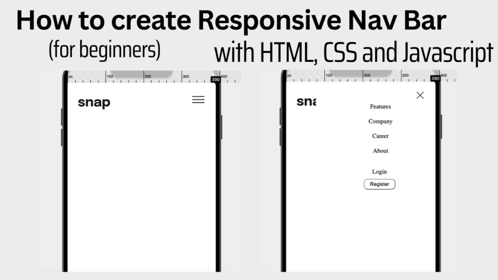
Knowing how to create a responsive nav bar is one of the important steps in learning to develop responsive websites. The navigation menu is the main part that lets visitors find the content and features they need. In this article, I will show how to create a simple responsive nav bar with HTML, CSS and Javascript. This article is directed towards beginners, so I will go more into details about the code here.
Create the HTML document
First, let’s start by creating a HTML document as shown below.
<!DOCTYPE html>

<html>

  <head>

    <title>Page Title</title>

  </head>

  <body>

    <h1>My First Heading</h1>

    <p>My first paragraph.</p>

  </body>

</html>
Add content inside the header tag
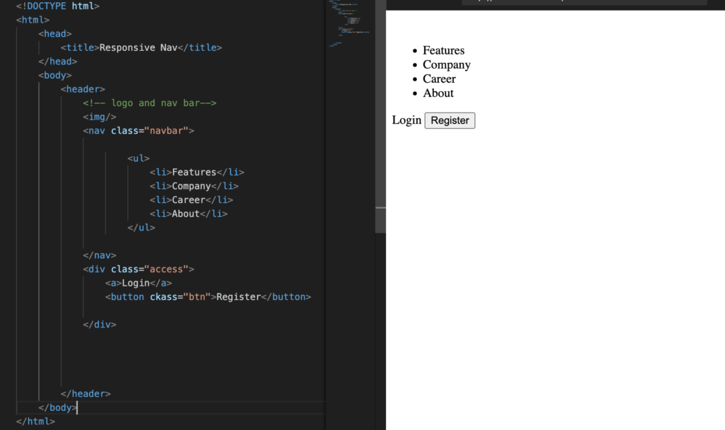
I will have three sections inside the header tag; one for the image, one for all the links in the middle with ul and li tags, and one for the login and register button.
Add styling in style.css
We will now start styling to make all the content inline. To do this, we need to have the style.css linked to the HTML file, so I will add my style sheet inside the head tag as follows.

One last thing to do is to add classes in the HTML document so that I can use the classes to style the respective elements. I added the classes as follows:
- id=”logo” inside the image tag
- class=”access” in the div with login and register
- class=”btn” inside inside Register button tag
Now I will go to style.css and style them as follows.
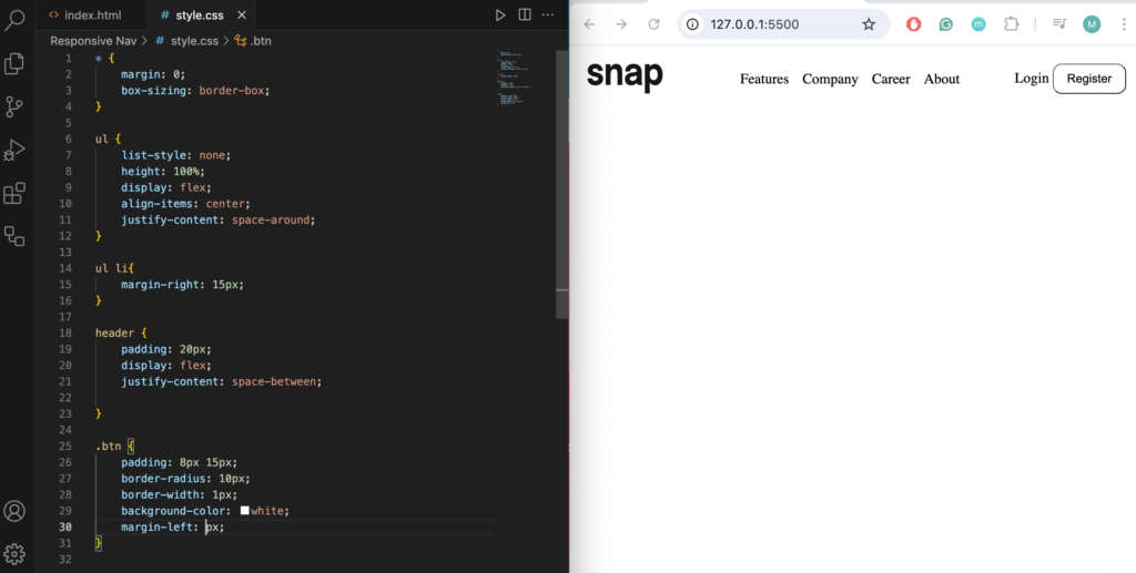
After styling, we are finished with the desktop view. I will now continue working on the mobile view.
Creating Mobile View
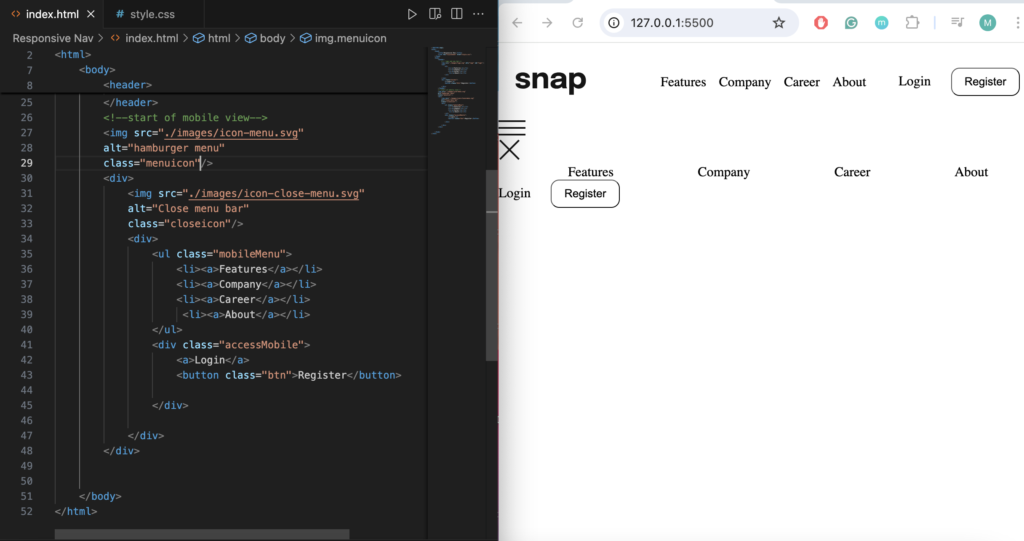
After going back to index.html, add the mobile view section underneath the desktop view. I will have an image tag for the hamburger menu. Under the image tag, I will have a div where everything inside the sidebar will appear. All content inside the sidebar is the same as the one in the header so I will copy and paste them down here.
Mobile view Styling
I will now add styling to the mobile view. I first add the following classes:
- class=”menuicon” inside the hamburger image tag
- class=”sidebarMobile” inside the div that wraps all the elements inside the sidebar
- class=”closeicon” inside the exit image tag
- class=”mobileMenu” inside the ul tag
- class=”accessMobile” inside the div with login and register button
Creating media query
Next, I will go into style.css and add different styling for the mobile view. I need a media query to do this. I will use the media rule to change style when the browser window is 600px wide or less as follows.
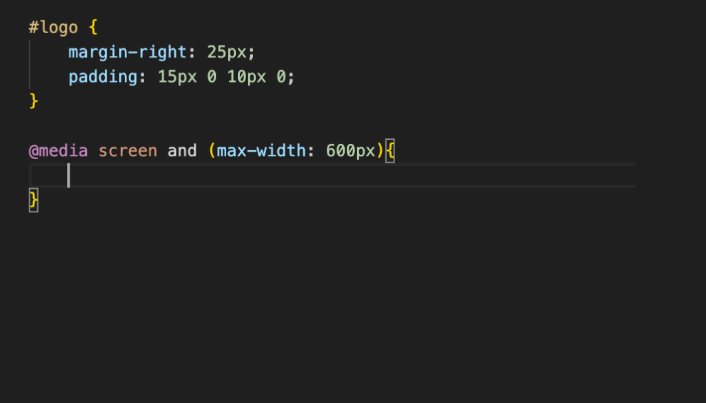
Any CSS that is written inside this media screen will be applied when the browser window is 600px wide or less.
Since the elements for mobile view are appearing while still in desktop view, I will go ahead and make them invisible on screens bigger than 600px first.
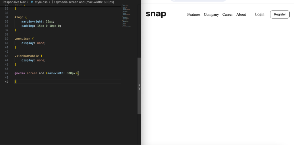
Adding ‘display: none;’ to the mobile classes makes them invisible on desktop view.
Now everything that is for the sidebar is invisible. I will make the browser window less than 600px now to show what it looks like right now.
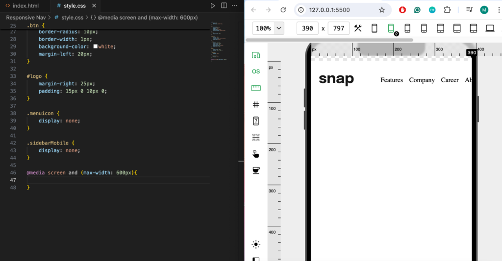
The nav bar we are seeing on the mobile screen is the one from the desktop view. I need to make the links from the desktop view invisible. Then I will make the sidebar visible and style it as needed.
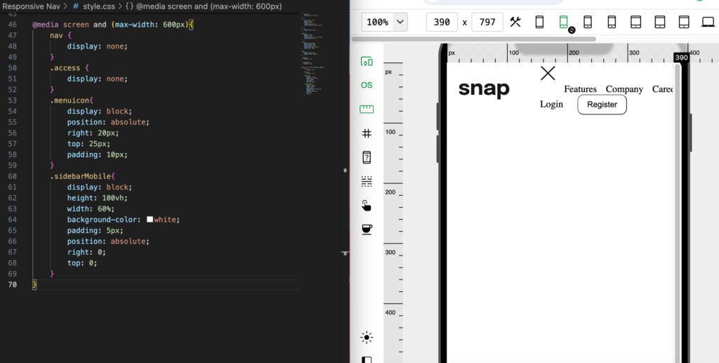
Just like on the desktop view, adding ‘display:none;’ causes the desktop links to become invisible, and using ‘display: block;’ makes the mobile items appear.
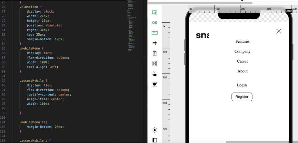
As can be seen, I still need to style the sidebar elements. I will start by styling the exit button, then the rest of the elements.
Let’s go ahead and style them as follows.
Adding javascript for button click functionality
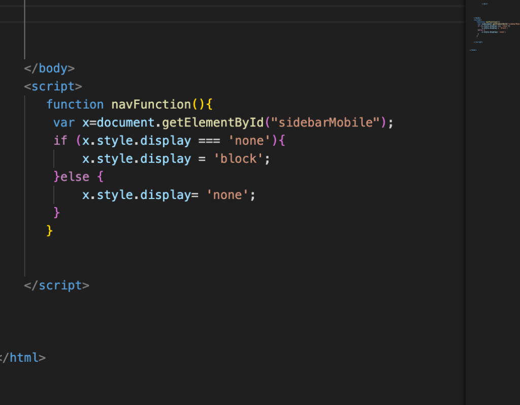
Now that I have styled all the elements in place, we will need a little bit of javascript to make the sidebar appear when we click on the hamburger menu and closes when we click on the close button.
I will go back to the HTML document and add a script tag after the closing tag of the body and add a function called navFunction() to it. I am using a document.getElementById here to look at the display property of the element I want.
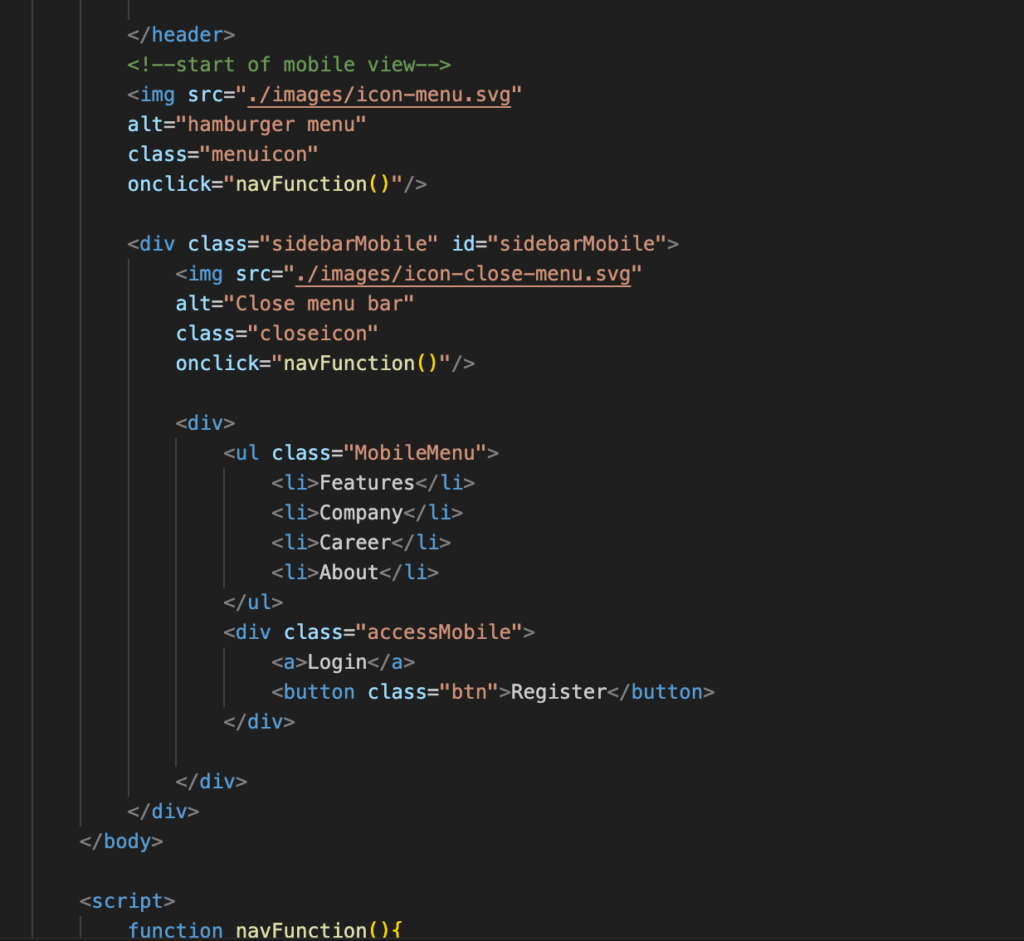
Now I will add the onClick event to the hamburger menu and exit icons and we get a functional sidebar that comes out when the hamburger menu is clicked and that closes when the exit icon is clicked.
Conclusion
While it may be daunting to start using Javascript in your code, we do need a little bit of Javascript to get an interactive display. Always use media queries to define different style rules for different screen sizes.


